Design Principles | Task 1 : Exploration
07.02.2024 - 20.02.2024 Week 01 - Week 03
Tracy Angeline Tio / 0362222 / Bachelor of Design (Honors) in Creative Media
Design Principles / Taylor's University
TASK 1 : EXPLORATION
TABLE OF CONTENTS
1. LECTURES
2. INSTRUCTIONS
3. TASK 1
4. FEEDBACK
5. REFLECTIONS
6. QUICK LINKS
Tracy Angeline Tio / 0362222 / Bachelor of Design (Honors) in Creative Media
Design Principles / Taylor's University
TASK 1 : EXPLORATION
Introductions : Elements & Principles of Design
- Visual Communication is about utilizing design to convey purposeful messages to a target audience. As such, the design must be well thought-out and executed. To achieve effective communication through design, it is important to learn about and apply the elements and principles of design.
- There are 7 elements of design :
1. Point
2. Line
3. Shape
4. Form
5. Texture
6. Space
7. Color
 |
| Fig 1.1 Elements of Design Week 02 14/02/2024 |
- Meanwhile, there are 11 principles of design :
1. Contrast
2. Balance
3. Emphasis
4. Rule of Third
5. Repetition
6. Moevement
7. Hierarchy
8. Alignment
9. Harmony
10. Unity
11. Proportion
Below are some of the example :
 |
| Fig 1.2 Principles Examples Week 02 14/02/2024 |
MIB February 2024 :
For this task, we were required to complete :
 |
| Fig 3.1 Task 1 Description Week 1 06/02/2024 |
1. The Design Principles
1. Gestalt Theory
Gestalt refers to "shape" or "form" in German. In design, Gestalt theory guides the arrangement of elements to create coherent and harmonious compositions that effectively communicate messages and evoke desired emotions. Designers use Gestalt principles to organize layouts, typography, color schemes, and imagery in ways that optimize visual clarity, balance, and engagement.
There are 10 Principles of Gestalt Theory which is :
- Reification/ Figure : This principle involves perceiving patterns and forms. Designers can leverage this principle by using suggestive shapes or incomplete imagery to engage the viewer's imagination and fill in the gaps.
- Multistability: Refers to the phenomenon where the same visual stimulus can be perceived in multiple ways. In design, this principle can be used to create ambiguity or novelty, inviting viewers to interpret and engage with the composition in different ways.
- Invariance: Invariance suggests that certain properties of an object remain constant despite changes in its appearance or context.
- Symmetry: Organizing elements in a way that creates balance and harmony.
- Continuity : This principle helps us to describe why we see moving pictures rather than individual photographs when watching films.
- Prägnanz: Is the principle of good figure, suggests that people tend to perceive objects in the simplest and most organized way possible.
- Proximity: Refers to the tendency to perceive objects that are close together as belonging to the same group. Designers can use this principle to visually connect related elements.
- Similarity: Grouping together elements that share common visual attributes such as color, shape, size, or texture.
- Closure: Closure refers to the tendency to perceive incomplete or fragmented shapes as complete objects.
- Past Experience : One of the hardest to predict because every person comes from a different background and has their own unique experiences. Example : Combining red, yellow, and green circle reminded us as a traffic light.
 |
| Fig 3.2 Example of Gestalt Theory (Source : here) Week 2 13/02/2024 |
2. Contrast
When we looked at Fig 3.3, there are 3 black bird and 1 white bird. That is contrast because our eye could focused to the different one. Contrast help us to guide the viewer's attention and prioritize information. Elements with higher contrast tend to be perceived first and are considered more important.
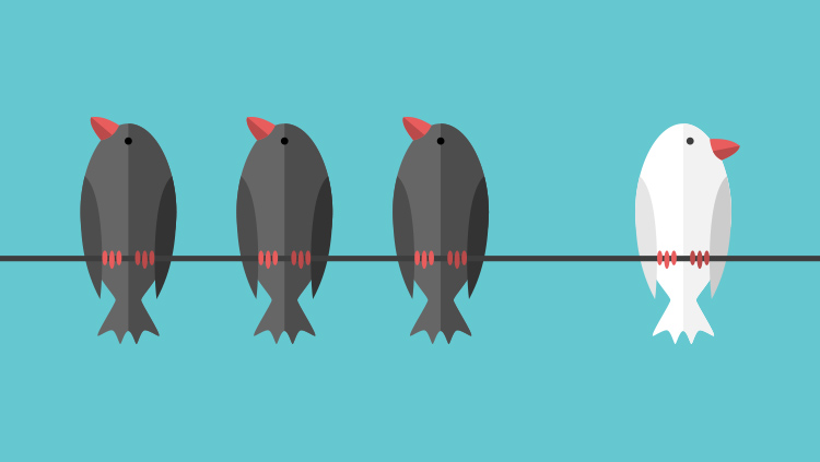 |
| Fig 3.3 Example of Contrast (Source : here) Week 2 13/02/2024 |
3. Emphasis
Emphasis in design refers to the visual prominence or focus given to certain elements within a composition. It involves directing the viewer's attention to specific aspects of a design, such as key messages, important information, or focal points.
 |
| Fig 3.4 Example of Emphasis (Source : here) Week 2 13/02/2024 |
4. Balance
Balance in design refers to the distribution of visual weight within a composition. It involves arranging elements such as shapes, colors, textures, and space in a way that creates a sense of equilibrium and harmony. There are three primary types of balance in design: Symmetrical, Asymmetrical, and Radial Balance.
 |
| Fig 3.5 Example of Balance ( Source : here) Week 2 13/02/2024 |
5. Repetition
Repetition in general means repeat that the objects could be use in second time or third time. We can look for the example below where the tickets elements had been repeated use from top to bottom. In design, repetition helps to establish visual consistency and reinforce the overall theme or message of the design. It can also guide the viewer's eye through the composition and create a sense of organization and structure.
 |
| Fig 3.6 Example of Repetition ( Source : here) Week 2 13/02/2024 |
6. Movement
Movement in design refers to the visual flow or sense of progression created within a composition. It involves guiding the viewer's eye through the design in a deliberate and engaging manner, creating a sense of dynamism and energy.
 |
| Fig 3.7 Example of Movement( Source : here) Week 2 13/02/2024 |
7. Harmony & Unity
Harmony and unity in design refer to the coherence and integration of elements within a composition to create a visually pleasing and balanced whole. Harmony in design involves the combination of different elements in a way that they complement each other and work together smoothly. Unity in design refers to the sense of wholeness and completeness achieved when all elements in a composition work together harmoniously to convey a single message.
 |
| Fig 3.8 Example of Harmonity & Unity ( Source : here) Week 2 13/02/2024 |
8. Symbol
A symbol in design is a visual representation that communicates a specific idea, concept, or meaning. Symbols are often simplified, graphic elements that convey complex messages in a concise and easily recognizable form.
 |
| Fig 3.9 Example of Symbol ( Source : here) Week 2 13/02/2024 |
9. Word & Image
In design, the relationship between word and image refers to how text and visual elements are combined to convey information, evoke emotions, and communicate messages effectively. This relationship is fundamental to various design disciplines, including graphic design, advertising, branding, web design, and publication design.
 |
| Fig 3.10 Example of Word and Image ( Source : here) Week 2 13/02/2024 |
2. UNSDG Goal
We were required to select one goal from the UNSDG. There are 17 option that we could choose.
 |
| Fig 3.11 UNSDG Goal Week 2 14/02/2024 |
After i briefly looked all of the goals, I go to the number 15 : Life on Land.
Life on Land means that we need to protect, restore and promote sustainable use of terrestrial ecosystems, sustainably manage forests, combat desertification, and halt and reverse land degradation and halt biodiversity loss.
Nowadays, there were so much news about war or even genocide as example like in Gaza, Ukraine and Russia, etc. There were used dangerous chemical as their weapon. Many building were crushed and especially the air also got contaminated on it.
 |
| Fig 3.12 Life on Land (Source : here ) Week 2 14/02/2024 |
From these goals, i realized that land is important for all the living things either it's human, animal and nature. Based on undp.org, Plant life provides 80 percent of the human diet, and we rely on agriculture as an important economic resources. Forests cover 30 percent of the Earth’s surface, provide vital habitats for millions of species, and important sources for clean air and water, as well as being crucial for combating climate change.
Every year, 13 million hectares of forests are lost, while the persistent degradation of drylands has led to the desertification of 3.6 billion hectares, disproportionately affecting poor communities.
While 15 percent of land is protected, biodiversity is still at risk. Nearly 7,000 species of animals and plants have been illegally traded. Wildlife trafficking not only erodes biodiversity, but creates insecurity, fuels conflict, and feeds corruption.
Based on those statement and data, we need to take an action to reduce the loss of natural habitats and biodiversity. Protect our global food and water security to gain the peace of our land.
3. Design Selected and The Reason
 |
| Fig 3.13 Chosen Artwork related to SDG Goals No 15 : Life on Land. Week 02 14/02/2024 |
Details :
Title : The Earth Begin to Cry in a Profound Grief
Artist : Elena Skochkova (14)
Year : 2007
Medium : -
Size : -
Reason for Selecting the Artwork :
At first, I was really proud of the 14 years old artist that could paint such a good like professional. In my opinion, the paintings had a relatively on SDG Goals which is life on land. That’s why I chose it for my work. It is storytelling about comparison between the good and bad side of our life. If we cooperate to protect our land from pollution and loss, we could gain a peaceful land where we could live and breathe rather than the bottom side with the opposite meaning. All just crushed and broken because of us. This paintings had a strong meaning to warn us to protect our land.
The Design principles I found on these paintings are contrast, repetition, emphasis, movement, harmony & unity, balance and lastly gestalt theory.
Week 2
- General Feedback : For the design recap, please use your own words and put a link of the source in your blog. Do not use the example on the lectures note. You should find yourself so that you can learn.
- Specific Feedback : All works were completed but for the principles especially the contrast and repetitions did not apparent. I need to showed my perspective on that principles. Moreover the grammatical error need to be revised.
Experience
I've gain a new knowledge of applying principles like contrast, balance, alignment, repetition, and harmony, etc. plays important role to made a cohesive and visually appealing artwork. Experimenting with these principles allowed me to understand their nuances and impact on the overall design outcome.
Not only for the design principles, I also got introduced to the United Nations Sustainable Development Goal (UNSDG) especially goal number 15 Life on Land. The goals really attract me because land plays an important role of our life. It is a good idea and experience if we could find/create an artwork based on it to made more people aware of our land.
Observation
Observation played a crucial role as well. By analyzing others people designs like this task on different mediums such as digital or manual art to made the artwork. I gained insights into how designers/artist leverage principles to convey messages, evoke emotions, and guide user interactions. It became evident that successful designs often strike a delicate balance between creativity and functionality, with each element serving a specific purpose within the composition.
Findings
Design principles are not mere guidelines but fundamental building blocks that underpin effective visual communication. Whether it's establishing hierarchy through contrast, creating harmony through balance, or enhancing readability through alignment, these principles provide a framework for designers to organize and structure information in a meaningful way.


Comments
Post a Comment