Application Design | Project 3 : Low Fidelity App Design Prototype
02.12.2024 - 07.01.2025 Week 11 - Week 14
Tracy Angeline Tio / 0362222 / Bachelor of Design ( Honors ) in Creative Media
Application Design / Taylor's University
PROJECT 3 : LOW FIDELITY APP DESIGN PROTOTYPE
Once we done with the UI kit, we now could produce the low fidelity prototype. After we done the lo-fi prototype, We do have one step before moving to the high fidelity one, which is Usability Testing. Learned on this materials below on what and why it is important.
- In short, we firslty develop a task (3) then create a scenario on it. Don't forget to provide the steps as well so user might not to get confused.
1. Visibility of System Status
2. Match Between System and the Real World
3. User Control and Freedom
4. Consistency and Standards
5. Error Prevention
6. Recognition Rather than Recall
7. Flexibility and Efficiency of Use
8. Aesthethic and Minimalist Design
9. Help Users Recognize, Diagnose and Recover from Errors
10. Help and Documentation
LECTURES 13 (Week 11 : User Interface Visual Elements)
Once we finished the previous lectures, Mr. Zeon continue the lectures about User Interface Visual Elements. Here are the most common elements we found and we are gonna used to create the prototype later.
Line spacing and allignment samples :
Paragraph samples throught the width :
Tips to Pair Fonts
These are the color and swatches trial ideas, but following the 60/30/10 rules, the color I chosen would be :
Iconography
Components
On week 11 class (02/12), I showed my UI toolkit and he said it was all good and now I just could continue build the low fidelity prototype.
I decided to include log in things as a scenario so I create the demonstration when user want to type their email and password, there's a page where keyboard would be shown. I also added sign up and recover password page as an additional.
After I finished the login page, I create on the home page with the total of 3 variations. All of it have the same content except for the attempt 2 and 3, I put a greetings with the name on it to create a friendly interfaces.
So far, my overall progress for week 10 was until I reached the home page. During week 11 that happens tomorrow (02/12), I asked Mr. Zeon for feedback regarding on my overall design. He said that I need to carry on the hierarchy for the home page and he likes the Second design since it was user friendly greetings. So I combine all of the insight I got and here are the final attempts.
Once I finished the home page, I quickly began with the browse features for my scenario 2. Before I design the interfaces, I do a lot of changes since suddenly I got confused for design flow. Referring to the information architectures and user flow chart, I have a lot of things to be designed, so I tried to simplified it first since we only need 3 scenarios for the action interactions.
User Flow Chart Simplified :
More things I did for refine is the top and navigation page. I find that it was lack attractive and all of the icons size have different size. My solutions to fixed this is to find an icon that have the same size (square size) and using auto layout or grid for having the same margin sizes.
To activate the function, I made the elements to become a component. In the component, the prototype would be auto, which means we don't need to drag the lines one by one again, so it makes more effective way. For references, here is the tutorials I used to create a navigation bar function.

I made a new change from the current app, where I would introduces user to have a choice for select the categories they want. User can also used the search box and even filter and sort function for this sections.


On class, I have showed my progress especially on the job details sections. He said that the application form could be improved more like add on some heading before just start with the notes. I take on his advices and quickly revised it.
Job Details were divided into 2 sections following by it's content from the Freelancer app. About the job is where we could scroll down and view all the information on it. Meanwhile on View Proposal, we can see the information from the applicants that already placed a bid on the job.
The manage features were used in order to view their recent jobs and create a tasklist to organize their planning ideas. The prototype shown the progress to create a new tasklist and there's a pop up on the bottom where user have a choices to edit and delete task. I want to include these tools on Scenario 1 where user could log in and explore around the pages.
As for the social pages, I followed the same design styles with the current app, but with a little changes for the spacing and the cover images of the group. I also added post features to the social pages since it matched. The original of the posts is probably on the home page for the current app. Despite than remove it, I plan to put it on what it should be match.
The last page is the Account page. This page took longer than I expected since there were so many features inside and I want to make all of it could be clickable.
The longest things need to be completed it on the profile page, as there were pretty much contents need to be added, following the contents based on the current app. Initially, I have an idea to just make it like we could upload a file of our resume but it's not gonna be interesting since we can't view on what it's inside and did not have scroll interaction too.
Currently, the Radio button on Theme and Languanges does not have interactions and I might added the components if user give feedback on it. At last, My prototype pages ended on the Security, Support and Log Out pages as the final steps.
I finally reached out the end of the prototype pages at around 70+ pages !. Here is the overall preview of the prototype and the next step is to connect all of the button for each pages and applying animation on it.
From this things, I also discover more features like tasklist for example. It also could be 2 possibilities when user already placed on the tasklists, If they click go back and they want to view it again, the task should be there. I copied same step where I duplicate the page too.
Once I finished improved it, I have showed again my result to the user I recruited previously. Overall, they was satisfied with what I have been improved. Now, I'm ready to finalized my low fidelity prototype.
Application Design / Taylor's University
PROJECT 3 : LOW FIDELITY APP DESIGN PROTOTYPE
TABLE OF CONTENTS
LECTURES
LECTURES 11 ( WEEK 11 : Usability Testing & UI Kit )
Throught this week, we finally began on our final project which is creating prototype for the redesign application. There were two types on this task which is low fidelity prototype and high fidelity prototype. However, we can't just proceed with just go straight to the prototype. All things we have to do is to create an UI Kit.
- UI kit is a pre - packaged collection of all UI Components for a mobile app or website. With UI kit, it would make designer easier since they don't need to create every design component from scratch.
- UI kits can be used as templates for niche specific use cases. For examples, all job apps should have a similar user interface, like searching job, home, profile pages, etc. As long as it on the same theme app, designer can use these wireframes as a starting points.
- UI design has a massive impact on how much time users spend in an app. If the app is well designer, easy to navigate and responsive, user would likely to be more interested into it.
- Mr. Zeon provides a sample on UI toolkit. There were 5 categories as shown on below :
1. Typography
The selected font to be used and variety of font sizes with hierarchy.
2. Iconography
Paired with typography and to clarify what an element does for user.
3. Layouts and Grids
Make it structured, same padding from top, bottom, left and right. Without this, some components might be messier.
4. Color Palette
The tone and feel of the product. Since we redesign an app, Please refer to the color of the company provided.
5. Components
How a set of components should looks when placed together, like buttons and typography for example.
 |
| Fig 1.1 UI Kit Materials and Example Images Week 11 02/12/2024 |
- Usability testing is a process to evaluating a product or service with representative users. Participants are tasked with completing specific actions while observers record notes.
- The main function on usability testing is to detect usability issues, gather qualitative data and assess overall user satisfaction. It does not yield large feedback samples like questionnaires.
- To conduct an usability testing, we have around six steps as given by our lectures :
 |
| Fig 1.2 How to Conduct UX Research with Usability Testing Week 11 02/12/2024 |
Examples on Usability Testing Scenario and Steps :
Browsing a Job
- In this scenario, Imagine you would like to find a job in search features. You can type what have you want to looks in the search box, or you can select the categories provided and using the filter and sort icon beside the search box.
Steps :
1. Navigate to the search pages.
1. Navigate to the search pages.
2. Select "find a job"
3. Click the search box and type what you want to look. You can choose other options as well.
4. Once you done type it, Click the enter / search icon.
5. Scroll down to see which job suited for you
6. Click the job page and you would be entering to the job details page.
LECTURES 12 (Week 11 : Usability Heuristics for User Interface Design)
By this week, we proceed to the materials 12 about usability heuristics for UI Design. We followed on Jakob Nielsen theories about 10 Usability Heuristics for this lectures.
By this week, we proceed to the materials 12 about usability heuristics for UI Design. We followed on Jakob Nielsen theories about 10 Usability Heuristics for this lectures.
- Usability Heuristics are general principles or guidelines (Rules of Thumb) that designers and usability experts use to assess and enhance the user friendliness and overall usability of products like websites and applications.
- Jakob Nielsen once said "The more users expectations prove right, the more they will feel in control of the system and the more they will like it" . In average, when you ask someone to perform a task on a site and they can't do it, It's designer fault to not create a well designer usability on the app.
- The 10 Usability Heuristics provided by Jakob Nielsen as stated on below :
 |
| Fig 1.3 Jakob Nielsen 10 Usability Heuristics Week 11 02/12/2024 |
1. Visibility of System Status
A system should consistently inform user about it's current state to ensure that users can always see the system status and undestand it. People strive for predicatability and control, therefore, more information translates to better decision making.
  |
| Fig 1.4 Example of Visibility System Staus Week 11 02/12/2024 |
2. Match Between System and the Real World
The importance od designing interfaces that align with users real world experiences and expectations. This means a system use familiar concept, languange and conventions to create a seamless and intuitive user experience.
- Visual Metaphors : Use of icons and images that represent real world object. For example : Delete, use trash icon.
- Use of Familiar Languanges : Use words, phrases and concepts that are familiar to the users.
  |
| Fig 1.5 Example of Visual Metaphor and Familiar Languanges Week 11 02/12/2024 |
3. User Control and Freedom
Allowing user to feel in control of the interfaces and providing them with the flexibility to undo or redo actions. Example : allow to go back, close link to dismiss.
 |
| Fig 1.6 Example of User Control and Freedom Week 11 02/12/2024 |
4. Consistency and Standards
Maintaning uniformity and predictability throughout the user interface to emphasize the importance of using consitent design elements, patterns and behaviors.
- Visual Consistency : Using consistent colors, typography, icons, etc
- Functional Consistency : Ensuring similar actions behave the same way throught the system.
- Feedback consistency : Consitent feedback for user actions such as success messages, error notifications and loading.
 |
| Fig 1.7 Example of Consistency and Standards Week 11 02/12/2024 |
5. Error Prevention
Design interfaces to reduces the likehood of users making mistakes and provides mechanism to correct errors if they occur. The key on this part is :
- Clear instructions : Providing a clear and concise instructions to guide users.
- Confirmation Prompts : Asking for confirmation before irreversible actions.
- Validation : Checking user inputs in real-time (passowrd, email, format, etc).
 |
| Fig 1.8 Example of Error Prevention Week 11 02/12/2024 |
6. Recognition Rather than Recall
It's easier for users to recognize information or options presented to them rather than having to recall it from memory. The key aspect on user app is :
- Menu Navigation : Clear and accessible navigation menus or icons that user can easily recognize and click on to find desired information or features.
- History and Favourites : Allowing users to access recently used items or mark favourites to reduce the need to remember specific details or locations.
 |
| Fig 1.9 Example of Recognition Rather than Recall Week 11 02/12/2024 |
7. Flexibility and Efficiency of Use
Designing interfaces that cater both novice and experiences to accomplish tasks in way that suit their expertise and preferences. The key aspects :
- Customization : Allow user to personalize their interface settings
- Shortcuts : Providing power users with shortcuts and improve efficiency.
- Adaptability : Designing interfaces that can adjust to user proficiency levels, simpler or more detailed options.
 |
| Fig 1.10 Flexibility and Efficiency of Use Week 11 02/12/2024 |
8. Aesthethic and Minimalist Design
Focuses on simplicity, clarity and visual appeal while minimizing unnecessary elements. The key principles on this part :
- Simplicity : Using only essential elements
- Visual Hierarchy : Organizing content and elements in a way that guide users attention.
- Whitespace : Using ample whitespace to create a breathing room on elements
- Consistent Typography and Colors : Using harmonious palette and consistent typography to create a cohesive visual identity.
 |
| Fig 1.11 Examples of Aesthethic and Minimalist Design Week 11 02/12/2024 |
9. Help Users Recognize, Diagnose and Recover from Errors
Usability principle focused on guiding users through the error handling process. The key aspects include :
- Clear Error Messages : Provide specific and easy to understand error messages that explain what went wrong and suggest how to fix it.
- Visual Cues : Use visual indicators such as icons or color coding to highlight errors and draw attention.
- Guided Recovery Paths : Offer step by step instructions or links to help pages that assist users to resolve error.
 |
| Fig 1.12 Example of Help User from Errors Week 11 02/12/2024 |
10. Help and Documentation
Providing users with the necessary resources and assistance to understand and use a system effectively. The key aspects :
- Contextual Help : Offering tooltips, hints, or on screen guidance that appears when users hover over elements or interact with features.
- User Guides and Tutorials : Providing comprehensive documentation, tutorials to explain how to use it.
- Searchable Knowledge Base : Offering a searchable database of articles, FAQs, and troubleshooting to help find a solutions
- Online Support : Access to customer support, forums or community resources.
 |
| Fig 1.13 Example of Help and Documentation Week 11 02/12/2024 |
LECTURES 13 (Week 11 : User Interface Visual Elements)
Once we finished the previous lectures, Mr. Zeon continue the lectures about User Interface Visual Elements. Here are the most common elements we found and we are gonna used to create the prototype later.
- Visual Elements on UI :
- Line
- Shape
- Color
- Form ( Sign in, Create Account form )
- Texture
- Space
- User Interface Design Principles are :
- Text
- Color (Use lighter black instead of Pure Black #000000 since it rarely used)
- Shadow
- Buttons (Keep height between 40pt - 60pt)
- Photos (Should look quite Similar)
- Illustrations (Find it on Storyset, Icons8, Streamlineicons, Storytale.io)
- Cards (Include photo, icon, header, short text, lil data and button)
- White space
- How to make sure an element looks clickable?
You should tried to use different color from the text data. It can be bold, or using Blue color for commonly.
- User Interface Navigational Component :
- Search Bar : One line text input to search information.
- Breadcrumb : A line show path to current user location.
- Pagination : Navigation through pages.
- Slider : To set value or range in a given set.
- Tags : Used on the Lowest level of hierarchy to find precious content.
- Icons : Ways to text links and button.
- Carousel : For skimming among items.
- Mobile Specs : Size on element, font, layout grid, Include keyboard slide up.
- User Interface Controls :
- Dropdown : For selection, single line, multiple options, image.
- Radiobutton : For selection on only one option
- Checkbox : Vertical arrangement, can select more than one.
- Toogle : Select between 2 states, 1 State required.
- Date and Time Picker : Select date and time, calendar drop down.
- Grids : Improve readability and consistency.
LECTURES 14 (Week 12 : Design Essentials for User Interface : Color and Typography)
On week 12, we were briefed into the last lectures which focusing on Interface element : color and typography. Starting on the next week, we do not have lecture again since this is the last one.
On week 12, we were briefed into the last lectures which focusing on Interface element : color and typography. Starting on the next week, we do not have lecture again since this is the last one.
1. COLORS
- The process on determines the color on user interfaces :
- Choose the main color
- Create your palette
- Use 60/30/10 rule when applied it
- Platform references : Colorz, Kuler, Designspiration, Color Zilla.
Monochromatic Color and it's characteristics :
- Use of varying shades, tints, and tones of a single hue in a design
- Effective in minimalize designs
- Hard to go wrong
- Elements may blend, making it difficult for users to distinguish between different components or actions.
 |
| Fig 1.14 Monochromatic Color Example Week 12 09/12/2024 |
Analogous Color and it's characteristics :
- Groups of colors nect to each other on the wheel
- Easy for the eyes to follow and comfort
- Lack sufficient contrast, become monotonous or too uniform
 |
| Fig 1.15 Analogous Color Example Week 12 09/12/2024 |
Complemenrary Color and it's characteristics :
Triadic Color and it's characteristic :
The 60/30/10 Rules
Using Gradients Guide
- Pairs of color that are opposite each others
- Make design more vibrant and dynamic as they provide strong contrast
- Examples : Red & Green, Blue & Orange, Yellow & Purple.
 |
| Fig 1.16 Complemenrary Color Example Week 12 09/12/2024 |
Triadic Color and it's characteristic :
- A set of three colors that are evenly spaced around the color wheel
- Provide good balance between contrast and harmony
- Make designs stand out and capture user attention
- If it not done carefully, design might look too busy or overwhelming and create consistency issues.
 |
| Fig 1.17 Triadic Color Example Week 12 09/12/2024 |
The 60/30/10 Rules
 |
| Fig 1.18 Example of 60/30/10 Rules Week 12 09/12/2024 |
- 60% : Dominant Color (Overall tone and Background/ Large Section)
- 30% : Secondary Color (Buttons, Navigation Bars, etc)
- 10% : Accent Color (Important elements like call-to-action buttons, link, or alerts)
 |
| Fig 1.19 Gradient Example Week 12 09/12/2024 |
- Gradients are transitions between two or more colors that create a smooth blending effect. It can be linear or radial.
- Gradient pros :
- Visual Appeal : It can make the design more attractive by adding a sense of movement and fluidity,
- Depth and Dimension : Help create an illusion of depth, make it more 3D.
- Focus and Emphasis : Draw attention to specific elements, guide user to important part.
2. TYPOGRAPHY
- When we talks about typography on user interfaces, it got various type starting from it's hierarchy, spacing and paragraph.
Hierarchy on Typography, Including heading, sub heading and description. Others might be the weight and size of the font.
 |
| Fig 1.20 Hierarchy on Font Size Week 12 09/12/2024 |
 |
| Fig 1.21 Font Size and Weight Comparison Week 12 09/12/2024 |
Line spacing and allignment samples :
 |
| Fig 1.22 Aligment Sample Week 12 09/12/2024 |
Paragraph samples throught the width :
 |
| Fig 1.33 Comparison on Bad vs Good Width Week 12 09/12/2024 |
Tips to Pair Fonts
- Combine highly contrasting fonts
- Combine fonts from the same typefaces
- 2-3 fonts maximum
- Combine similar moods
 |
| Fig 1.34 Font Guidelines Week 12 09/12/2024 |
Resources for UI samples :
- Mobbin.com : App design inspiration
- M2.material.io : Google Material Design to provide guidelines, component and tools to help designers
- UI Store Design : Wide range of free UI kits
- Color Zilla : Grab a color on website
- Whatfont : Detect font used on the app
INSTRUCTIONS
MIB BOOKLET :
PROJECT 3
Low Fidelity App Design Prototype
Once the UX design process is completed, students can now create a low fidelity prototype of the app. Students needs to arrange all the screen wireframes, actions, visual feedback and link them up in prototype software’s. Students are then required to perform usability testing whereby they will invite guests to test out their low fidelity prototype and gather all the information, response, feedback, pain points observed from the test.
Requirements :
- Develop a moodboard / visual design concept that aligns with the branding of your application including typography, color, icon, sketches,etc.
- Create a wireframes of the screen of your mobile application. The wireframes should illustrate the layout and content of each screen, using software tools such as Adobe XD, Figma to create it.
- Conduct usability testing on your lo-fi prototype (3 people) and document their feedback.
- Submit a video walkthrough and brief explanation about your prototype in your e-portfolio.
---
1. UI Toolkit - Visual Design Concept
After I finished the project 2, UI/UX Document, I quickly began by planning my UI toolkit. Before creating it, I already find a references on the sample of others job application as well. Below are the Figma file of the toolkit.
Figma Link :
Fig 3.1 UI Toolkit in Figma Week 10 01/12/2024
Color Palette
I followed the company official color for the color palette. Freelancer was dominantly with a black and white color with blue color around 10%. Some comment from Project 2 said the color were too monotous, so I changed the color strcuture a litte, Adding blue as their dominant color.
 |
| Fig 3.2 Color Swatches Idea Week 10 01/12/2024 |
- 60% : Black #1F1F1F and White #FFFFFF
- 30% : Blue #29B2FE
- 10% : Pink #E60278
Typography
For the typography, I used Whatfont as an extension to detect the font on Freelancer app. The app use Roboto as their typography but on this redesign app, since Roboto is too standard, I decided to explore more font that matches with nowadays design and it's still similar with the default font by company. "Inter" was my choices for the final font selection.
 |
| Fig 3.3 Font Selection Week 10 01/12/2024 |
Iconography
For the icon, I used iconify as my main plugins to collect the sources. I followed Freelancer current design which they had 2 styles of icon, 1 solid color icon for navigation bar and outlines icon inside on the pages. This was an ideas that I saved, I might changed it if several feedbacks were given.
 |
| Fig 3.4 Icon Ideas for App Design Week 10 01/12/2024 |
Components
As for the components, I tried on different color to tested out, but most of the components were designed based on default shape on Freelancer app.
 |
| Fig 3.5 Components Ideas for App Design Week 10 01/12/2024 |
Layout and Grid
Figma offered column and grid tools to ensure that all of the pages got the same margin. I used 6 columns and 1px for the rows during this project. The calculations are based on the navigation bar (since I have 5 tools, I insert it between on the each columns).
 |
| Fig 3.6 Layout and Grids for App Design Week 10 01/12/2024 |
References
Finally for the references, I used a quite lot of sources to gain an ideas what the design would be. I use Fiverr, Upwork, Fastwork app and Pinterest, Dribble as my main sources of ideas.
 |
| Fig 3.7 Dribble preview Week 11 01/12/2024 |
 |
| Fig 3.8 References Design Ideas Week 10 01/12/2024 |
2. Low Fidelity Prototype in Figma
The first page I built is the loading page and on boarding pages. Mr. Zeon has mentioned before to create 3 on boarding page before we entered the Log In page.
 |
| Fig 3.9 On Boarding Page and Log In Page Week 10 01/12/2024 |
 |
| Fig 3.10 Login Page Demonstration with Keyboard Week 10 01/12/2024 |
 |
| Fig 3.11 Home Page Attempts Week 10 01/12/2024 |
 |
| Fig 3.12 Home Page Attempts and Final Week 11 02/12/2024 |
 |
| Fig 3.13 Information Architecture Simplified and Improved Week 11 02/12/2024 |
User Flow Chart Simplified :
Fig 3.14 User Flow Chat Improved ver. From Project 2 Week 11 02/12/2024
Once I improve the flow, It would be more easier to understand and what I want to aim for my prototype. I also discover more that Figma could create something fantastic like animation and even interaction with the components.
First thing is I do create on the welcome page using splash screen animation tutorials that I found on youtube below.
Fig 3.15 Splash Screen Animation Tutorials Week 11 02/12/2024
 |
| Fig 3.16 Screen for Splash Animation Week 11 02/12/2024 |
 |
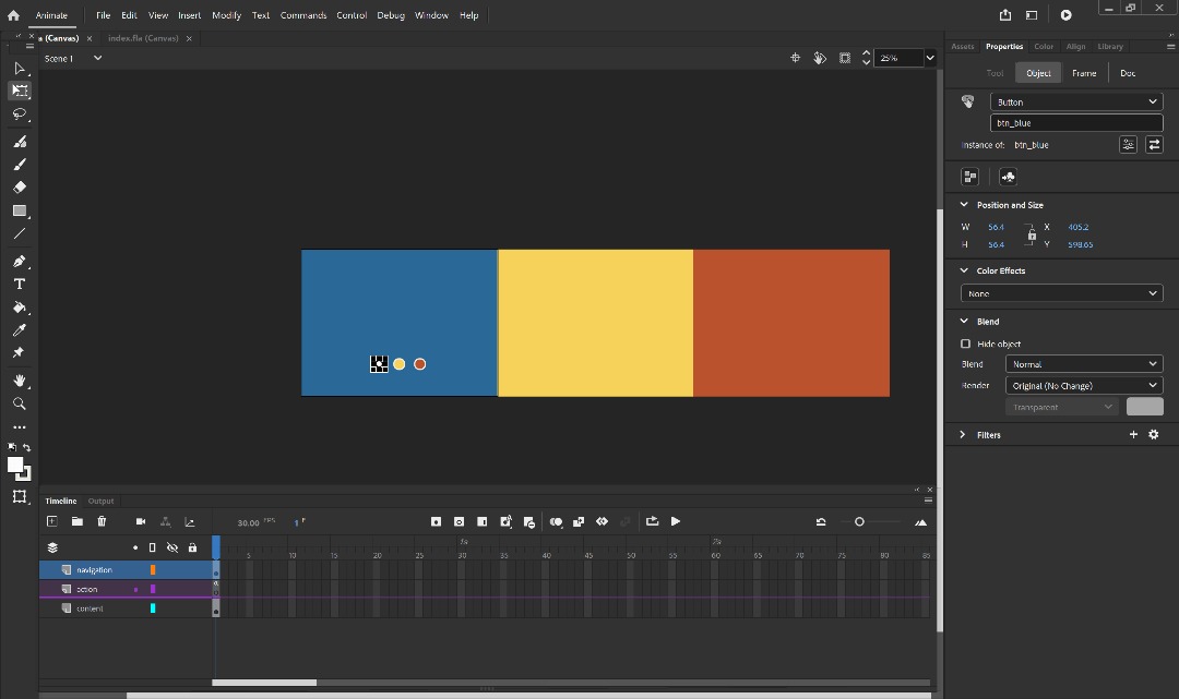
| Fig 3.17 Navigation Bar Before (Top) and After (Bottom) Holiday Week on 25/12/2024 |
Fig 3.18 Navigation Bar in Figma Holiday Week on 25/12/2024
After the components, I continue to develop the browse page. Browse pages is gonna be an important and longest part since it included two scenario insides. For the content, I still kept it based on Freelancer app have. It got 4 choices which is to find a job, find contest, freemarket and hire a freelancer. On my prototype, only 1 function would be available since my role is a student who want to find a job, not to hire freelancer. Here is the page progress preview.Fig 3.19 Browse Page Overall Week 12 09/12/2024
For the home page, I also added function where user can scroll it down and right using this articles by Figma learn : HERE.
Fig 3.20 Search Box and Filter and Sort Week 12 09/12/2024
Overall, the picture on top is the main tools for the browse part. The rest is just a demonstrations step where user could tap it one by one to increase interactions. Regarding the filter and sort, I'm having hard time at first since in Freelancer app, the filter is really broad. To solve this problem, I downloaded more job and freelancer application to gain better understanding. Fast Job, Fiverr and Fastwork is the references I used to built the filter and sort since it's quite similar with freelancer but more simplified.Fig 3.21 Filter and Sort References Week 12 09/12/2024
 |
| Fig 3.22 Components, Pop Up, and Result After Filter and Sort Week 12 09/12/2024 |
To create on the loading animation and pop up for prototype later, I used on this video below as my guide. Overall, the component had a same step where you want to animate something (one by one) while to make the pop up, you have to use open overlay.
Fig 3.23 Loading Animation Guide Week 12 09/12/2024
Fig 3.24 Pop Up Animation in Figma Week 12 09/12/2024
To recap, on my week 12, I managed to finish the scenario 2 which is to browse a job. The next week , week 13 is to complete scenario 3 and scenario 1 all features.
On week 13, I did everything in a rush until the holiday week to make sure that I could finish on time and start high fidelity prototype ASAP. The prototype continues to the scenario 3 by place a bid on the job once we done search the job we want from scenario 2.
 |
| Fig 3.25 Attempts #1 on Place a Bid Session Week 13 15/12/2024 |
 |
| Fig 3.26 Job Details, View Proposal and Place a Bid Form Improved Week 13 18/12/2024 |
Through this placing a bid progress, it's not just over after we done place a bid. I give the user 3 options where they could view their proposal, retract and even edit the bid. To make the process longer, I want user to try on when they want to retract their bid, a pop up and toast messages could appear, so it would increase more interaction.
Done with the Place a Bid scenario, I move out to continue design on what need to be completed based on the navigation bar on the bottom. Next is the manage page.
 |
| Fig 3.27 View Proposal After Placing the Bid Interaction Week 13 18/12/2024 |
 |
| Fig 3.28 Toast Messages Notifications (Using After Delay), 26/12/2024 |
 |
| Fig 3.29 Manage Page Overall Week 13 15/12/2024 |
 |
| Fig 3.30 Social Pages, 25/12/2024 |
 |
| Fig 3.31 View Profile Page and Membership Pages, 25/12/2024 |
 |
| Fig 3.32 Content Inside the Profile Pages, 25/12/2024 |
On the consultation class, I received feedback that the description part is not really appealing especially on what I offer part. He recommend me to instead just use some tag to make it shorten.
Moving on to the membership pages, I would like to create it like carousel using the button as interactions to select and preview all the membership.
 |
| Fig 3.33 Membership Choices, 25/12/2024 |
 |
| Fig 3.34 Balance and Settings (Theme and Languanges) Page Design, 25/12/2024 |
For the security pages, user could click the switch to turn on the authenthication. User could also click the connected devices and account to see the preview. While on the support pages, user could interact with the client / freelancer button and hover the contact us button.
 |
| Fig 3.35 Security and Support, 26/12/2024 |
 |
| Fig 3.36 Overall Prototype Low Fidelity, 26/12/2024 |
 |
| Fig 3.37 All Components Created, 26/12/2024 |
 |
| Fig 3.38 Prototypes View, 26/12/2024 |
3. Usability Testing
Once I finalized all the pages, I create on User Scenario Description as a guide for user testing later.
Scenario 1 : Log In and Explore Around
Imagine you’re a university student on semester break and plan to be productive by freelancing to earn some income and experience through the Freelancer app. It’s been a long time since you used the app so you tried to navigate around to familiarize the interfaces. [ Key Features : Log In, Home, Account, Social, Manage ].Scenario 2 : Browse a Job and Apply Filter and Sort
In this scenario, after you familiarize yourself with the app, imagine you want to start searching for the job that matches with your skills. [ Key Features : Browse ].
Scenario 3 : Place a Bid on the Job
In this scenario, after you familiarize yourself with the app, imagine you want to start searching for the job that matches with your skills. [ Key Features : Browse ].
Scenario 3 : Place a Bid on the Job
In this scenario, Imagine if you want to place a bid based on the job you have searched for. Before placing it, you already have your profile filled with what needs to be filled in order to apply. [ Key Features : Browse, Job Result ].
Fig 3.39 3 Scenario for User Testing, 26/12/2024
For the usability testing, I have recruited 3 people and each of them was assigned to do one scenario as I instrcuted. View below for the video record of 3 user doing a usability testing.
Fig 3.40 Usability Testing Records, 27/12/2024
4. User Feedback
After they do the testing, I asked on some feedback of what are their thoughts and what could be improved. View this documents for user feedback. From their feedback, I made some summary notes about things that need to be improved.
Fig 3.41 User Feedback During User Testing, 28/12/2024
FEEDBACK SUMMARY
Scenario 1 : Log in and Explore Around
- The prototype was fine and no improved were needed.
Scenario 2 : Browse a Job
- On the filter pages, Add a range of price, not just the minimum prices .
- Languanges Filter felt like unnecessary. Instead, you can change it to the type ( fixed / hourly price ).
- Job description ( job details) text could make a little bit bigger.
Scenario 3 : Place a Bid on the Job
- Some page got a wrong directions especially in bid retract notifications ( need to re arrange the prototype flow ).
- Some possibilities could be happen in this scenario. Let's said like if the user did not want to retract the bid, they go back and want to re check again their bid in view proposal, their bid is not showen. My solutions for this is to duplicate the job details sections that have 2 options in view proposal. One is for when we retract the bid and one is when we tried to keep on the bid.
- Add a places to see what proposal I just applied, like in the manage or in the home page so we can know what are the proposal we applied on this app if more than one.
Based on the feedback, I made some minor chances on the scenario 2 and 3. On scenario 2, I remove languanges section and instead change it to project type : fixed price or hourly rate. For the prices, there would be two session which is minimum and maximum.
 |
| Fig 3.42 Improvements for Filter Sections, 29/12/2024 |
After that, for scenario 3, I firstly change the font size on job descriptions as some user commented on it, and for the prototype flow, to make 2 possibilities, I duplicate the job details page but with different flow. One is to view proposal when we retract bid and one is not.
 |
| Fig 3.43 Font Size Changed, 29/12/2024 |
 |
| Fig 3.44 Adding Page for Avoiding 2 Possibilities, 29/12/2024 |
Lastly, improved were made in the manage page where I added "My Bids" that contains on the job list on what we have applying on so anytime where user open the app, they know what are the job they already have placed a bid on.
I also do a changed for the 'Recent Job' into Recently Viewed which suited more since I could combine my finished together inside My Bids page.
 |
| Fig 3.45 Added New Features "My Bids" on Manage Page, 29/12/2024 |
And here is also the new features design for recently viewed. I made a dropdown menu since Freelancer have 4 type of offers and it's better to separate each of it.
 |
| Fig 3.46 Recently Viewed Page, 29/12/2024 |
 |
| Fig 3.47 Overall Improved Page Prototype, 29/12/2024 |
FINAL OUTCOME PROJECT 3
Walkthrough Video Link : https://www.youtube.com/watch?v=bZEaoWqM_Ho
Fig 3.48 Freelancer Low Fidelity Prototype Walkthrough, 29/12/2024
Link to Figma File :
Fig 3.49 Final Low Fidelity Prototype Design, 29/12/2024
Link to Figma Low Fidelity Prototype View :
Fig 3.50 Final Low Fidelity Prototype Design (Preview) , 29/12/2024
FEEDBACK
Week 11
General Feedback : The deadline on low fidelity and high fidelity prototype is on week 15, so make sure you adjust your time properly and finished on time.
Specific Feedback : I showed my UI toolkit and my current wireframes progress. He said my progress is fine and acceptable but in the 'on boarding page', The images should not be included and change it to image icon. As for the wireframes, Mr. Zeon liked the second and third design but he suggest that I could pay attention to the hierarchy. Popular services should come first rather than explore the trend.
Week 13
Specific Feedback :
- Overall your progress was good and you just need to continue and fixed what I commented to you on what you have until finished
- On the place a bid page, feels like something is missing. You could add some header before they dive to the form like a header
- On view proposal part, your proposal spacing could be a little bigger and tried use different color. Make it stand out / highlight it.
- Don't forget to create the interaction as well for the home page part.
Holiday Week [ 26/12/2024 ]
Specific Feedback :
- On your view profile description part, you can try to make it like a tag for what you offer (skill). The first paragraph seems okay. Just after your introduction, it needs some refinements.
- All was okay and could be finalize for the overall prototypes outcomes. You can now began the usability testing and see if there's a feedback or not.
- After testing you can began with the High Fidelity one. Use dribble as a sources for the app colors and let's see how you can play with the colors especially on the job listing part.
REFLECTIONS
Experience
Working on the freelancer prototype was a great and challenging experience for me. At first, I was a bit exhausted since the current app probably have so much features to be explored on. Even if we were only tasked to 3 scenario, It just does not felt enough for me if only redesign on what scenario want. Also, my user wishes if this app would be good if it turns to real app so I hopefully could fulfill their expetations by making it broaded and interactive as well. As the final result, it got almost 80 pages of total, since I tend to demonstrate each of little step by showing keyboard, close keyboard, etc.
Observation
A good app should at least have all the usability heuristics that Jakob Nielsen mentioned. It should have not make user confused, easy to understand and prevent them for several bad things happened by make some notices or instructions. Interface design and spacing on Typography also were important for readability and entertaining function.
Findings
I found out that Figma was such a good app for UI/UX designer since it offers so many various things we can do. From this task, I learned so much whenever using Figma start from animation, components, variants and others. This would be a good start for future use. Moreover, since we already get a basic layout structure from this project, I can't wait to see on how it turns on the high fidelity later. Hopefully there would be more interactive things.

Comments
Post a Comment