Major Project 1 | Task 3 & FINAL : Concept Presentation
09.03.2025 - 25.03.2025 Week 06 - Week 08
Tracy Angeline Tio / 0362222 / Bachelor of Design ( Honors ) in Creative Media
Major Project 1 / Taylor's University
TASK 3 & FINAL : CONCEPT PRESENTATION
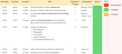
I set up the deadlines and duration in order to finish it on time. Based on the task, the first things to do is gather a references. Me & Marsya took a responsibilities for that part. I started to collect references through dribble, behance, google and internet. We divided the references style into 3 categories based on our findings.
From the references research, I planned to create on mix style, blend with real photos especially for the profile and pet, combined with illustration assets and characters. Since this was for a final project showcase later, I want to challenge myself and draw my own assets.
Moving on, the next task was Information Architecture and Card Sorting. Marsya, Velicia and Me was in charge to do this part. Firstly, Velicia do the analysis from the competitor analysis and gain some information regarding on features we want to have on the app.
Before we inserted it into UX Tweak, we have made a 1st attempts for the card sorting, but we are not sure about the result of it. We tried to reduce 5 cards to be inserted in UX Tweak (Maximum 20 Card).
Below are the result for the card sorting after we gather the answer. I introduced a new features, combined from FAQ and Contact Support which is AI Virtual Assistant Bot, in order to make it convenient.
Meanwhile, after the card sorting, Velicia helped me to do the final information architectures. It can be see on the images below.
Once the information architectures is done, I began to develop a user flow chart, start it when user open the app. I used the references from what I have learned in Application Design 1.
To summarize the user flow chart, there are 8 main different category and all of the information are available in presentation slides.
Finally, I finalize my chosen font which are Niramit (Heading) and Mulish (Body).
Next day (17/03/2025) I began to start designing my lo-fi prototype through manual sketches. It's been a long time since I sketching and with sketches, I can explore it more easier rather than straight started it on Figma. These are some photo documentation during sketches.
On 18/03/2025, I attend a consultation with Mr. Nedu and showed our progress so far. He said that my prototypes and guideline was overall okay and I can proceed to present it on the next day. View this document below for my lo-fi prototype sketches.
We had a presentation as the turn given by Dr. Wong, With 12 minutes of times and 8 minutes for Q&A. Overall we succesfully finished the presentation, deliver what we want to show and answering the questions given.
FINAL OUTCOME TASK 3 & FINAL : CONCEPT PRESENTATION
Major Project 1 / Taylor's University
TASK 3 & FINAL : CONCEPT PRESENTATION
TABLE OF CONTENTS
LECTURES
No Lectures for this Task. View Previous Lecture on Task 1 : Proposal Development.
INSTRUCTIONS
MIB BOOKLET :
UI/UX GUIDELINE :
TASK 3 & FINAL
Concept Presentation
On this project, Students are required to demonstrates the culmination of how your design solution effectively addresses a specific need in your targeted audience, utilizing a newly created product or service that brings unique social, cultural and/or economic value through presentation slides.
The presentation should clarify how the solution addresses multiple contextual factors and the extent of how new directions or approaches in design were implemented. There should be explanations of how you have analysed success and failures throughout the entire design journey and the mention of design review processes, outcomes and the need for further work.
The Checklist for the Final Task are as stated below :
- Brainstorm ideations using storyboarding, etc. [Group]
- Design inspiration from other design resources/websites for ideations [Group]
- Develop Information Architecture (i.e. Card Sorting Method) for your proposed solution [Group]
- Develop User Flow/Work Flow diagram [Group]
- Design Design Guideline (colour scheme, typography, UI component etc) that is related to the project topic and targeted user personas [Individual Work, or Group Work]
- Initial Lo-fi prototype (sketches or wireframe) [Individual Work]
- Group Presentation (10%) on 19 March 2025 (On-site)
- Final Submission (Group) will be on 25 March 2025 (Team online)
---
WEEK 6
Before week 5, we already have to started planned and divided task as for the task should be. As a group leader, I started to create a specific project development plan and list down the task to be chosen my group members later.
 |
| Fig 3.1 Task Delegation for Final Task Week 05 07/03/2025 |
 |
| Fig 3.2 References #1 Photo Style and Minimalist Week 06 09/03/2025 |
 |
| Fig 3.3 References #2 2D Illustration (Full of Illustration for this Part) Week 06 09/03/2025 |
 |
| Fig 3.4 References #3 3D Assets and Mixed Week 06 09/03/2025 |
After we done the references, the next thing to do is the storyboard. Gawai volunteered to assigned on this part, and the images below show the result of our storyboard throught pet adopter POV.
 |
| Fig 3.5 Storyboard in Pet Adopters POV Week 06 09/03/2025 |
From the analysis, we have come up with 7 different categories and a total of 25 features inside that need to be sorted out.
 |
| Fig 3.6 List of Card and Categories by Me and Velicia Week 06 12/03/2025 |
I was in charge for place the information into UX Tweak. This was some progress of it.
After that, all of us contribute to share the UX Tweak Link and we gain 9 total of responses in the next day, 15/03/2025.
I started to do the analysis in Figjam Board and quickly sort the card again.
The result of analysis can be seen on Figjam board.
 |
| Fig 3.7 Insert the Card into UX Tweak Week 06 14/03/2025 |
I started to do the analysis in Figjam Board and quickly sort the card again.
 |
| Fig 3.8 Standarization Grid on UX Tweak Week 06 15/03/2025 |
 |
| Fig 3.9 Analysis of UX Tweak Answer Week 06 15/03/2025 |
 |
| Fig 3.10 Final Card Sorting App Week 06 15/03/2025 |
 |
| Fig 3.11 Final Information Architectures Week 06 15/03/2025 |
 |
| Fig 3.12 Good Pat User Flow Chart Week 06 15/03/2025 |
- Home, to see what is popular
- Browse Pet for Adoption and see our favourite pets.
- Adoption & Care Guide, With Tasks
- Community to share and discuss
- Offers & Extra Deals for the Pet
- Live Chat to Communicate with People and Shelter
- User Profile pages and Settings
- Pet Profile Detailed Information (Inside the Pet card)
After this stages, our group task started to become individual, which is creating UI Guidelines and Lo-fi Prototype by our own. I do it quick for this part, along with designing the slides presentation since we have final presentation at 19/03/2025.
WEEK 7
On this week, I mainly focusing on my UI Guidelines and Lo-fi Prototypes. The first thing to do in UI Guidelines is by doing the color research. For me, it is hard to find the right color since there were many choices for pet adoption topic.
At the end, after browsing and research, I decided to use blue and yellow as my primary color since there were contrast with each other, following with orange, cream and green as secondary colors.
 |
| Fig 3.13 Color Scheme UI Guide Week 07 16/03/2025 |
Next for the typography, I did a lot of browsing in google fonts to find a matching pairs and make sure the font is not too common.
 |
| Fig 3.14 Typography UI Guide Week 07 16/03/2025 |
- Niramit were chosen as a heading because it creates a strong visual hierarchy, allowing users to easily identify the information that matters.
- For the body text, Mulish (Regular - Medium) has been selected for its clean and minimal look to make it easy to read on a variety of screen sizes.
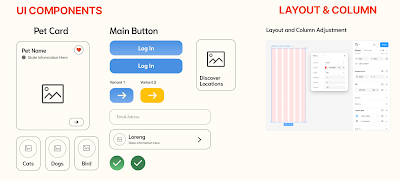
The next part, I started to do the UI Components and determine the layout and column sizes. For the UI Components, I designed pet card, button, categories, form input and some icon.
As for the layout, I used Iphone 14 & 15 Promax for the Shapes and the size are stated below :
- Rows : 1 px
- Column : 6
- Dimension size : 430 x 932 px
 |
| Fig 3.15 UI Components and Layout Week 07 16/03/2025 |
Regarding on the icon, I tried to find matching icon that have characteristic like soft and bubbly. I took it from figma and there's some icon I designed by combining some elements. I designed the navigation bar first and find a suitable icon for home, browse, adoption, community, offers.
- Home (House with Dog Logo Inside) : Represents the main dashboard or home screen with pet adoption theme
- Browse (A compass) : Compass symbolizes exploration, making it an intuitive choice for a search function that helps users find pets, shelters, or resources.
- Adoption & Care (Hand with Paws and Sparkling) : The paw with a hand conveys compassion and care.
- Community (People) : The two-person silhouette signifies social interaction, representing forums.
- Offer and Extra (Percentage Icon) : A badge with a percentage symbol suggests promotions, deals, or extra features.
Lastly for the UI Guidelines, I tried to design a dog character (corgi) and named it "Pat" since our app name is "Good Pat". The right pictures beside are the overall references I used for my guidelines.
 |
| Fig 3.17 Character Design and References Week 07 16/03/2025 |
 |
| Fig 3.18 Lo-fi Sketches Week 07 17/03/2025 |
Fig 3.19 Low Fidelity Prototype Sketches Week 07 18/03/2025
After creating the prototypes, I finally had finished my individual part and I do fill the presentation slides for main proposal and one more for the presentation.
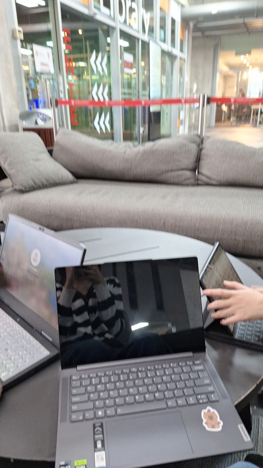
During presentation day, all of us met at 8-9 AM to discuss about how we should do the presentation and practiced it under 12 minutes. We also think on the possible questions lecturer would ask to us.
 |
| Fig 3.20 Group Discussion before Meeting Week 07 19/03/2025 |
WEEK 8
Altought there's not much refinement needed in our group after presentation, I want to give a try by designing the wireframe in Figma to see how it looks from my sketches. This pictures below show a looks for overall prototypes.
 |
| Fig 3.21 Lo-fi Prototype for Front Categories Week 08 25/03/2025 |
For the further planning, I plan to develop more pages after the front pages, and start sketching some illustration assets before Major Project 2 to be filled in the prototypes.
FINAL OUTCOME TASK 3 & FINAL : CONCEPT PRESENTATION
Final Proposal Research Slides
Proposal Link : HERE
Fig 3.22 Proposal Development Slides (Task 2) Week 08 25/03/2025
Final Figjam Board
Fig 3.23 Group 6 Figjam Board Discussion Week 08 25/03/2025
Final Lo-fi Prototypes (Digital Version)
FEEDBACK
Week 6
- For the Information Architectures, it looks okay and you can try to use UX Tweak since many group also use that.
- App name should be same for all group members.
- The presentation slides need to include from task 1 until task 3.
Week 7 (Before & On Presentation Week)
- Before presentation day, Mr. Nedu said that overall work is okay, but for the UI Guidelines, we need to specify the reason we are choosing that color / font.
- User Flow Chart can be summarized during the presentation later.
- Our Prototype presentation was a bit smaller and we need to adjust the size so all the lecturer can see it clearly.
- Try to think what to be filled for the lo-fi prototypes.
REFLECTIONS
Working on Major Project 1 Task was such an unforgetable journey. I learned a lot on how UI UX Research could be. At first, I thought this modules can be worked individually but turned out this is a group project, and I get to met my group mates, Velicia, Ga Wai and Marsya.
From task 1, I felt that working on affinity diagram was a new things and so far, I'm not really satisfied with the overall result and decided to improved it on second and final task. I want to thanks my group mates, Marsya that helped me to compile the affinity diagram and planning the overall contents.
Until task 2, so far I think that it looks like an individual task. The rest of my members were likely doing their individual and did not care about the group task, like competitor analysis and empathy map, resulting me doing the most of it and heavy workload. But, I'm glad that I could learning and find a new things.
As for the final task, it was fun and challenging at the same time. There were many things that need to do in a short time, which led me learn on how to work quickly in a short time. From task 3, there were many things I did starting from references, card sorting, flow chart, analysis UX Tweak and the Individual work. I just hope that the lecturer could provide a fair value for each members effort, and to my group mates, thanks for working hard and complete your work on time. I just wish they could active more in group discussion and fast responses.
Lastly, I want to thank all the lecturer that paying attention to our presentation and especially our supervisor that gave a valueable feedback to our group.


Comments
Post a Comment