Application Design II | Task 1 : Self Evaluation and Reflection
21.04.2025 - 18.05.2025 Week 01 - Week 04
Tracy Angeline Tio / 0362222 / Bachelor of Design ( Honors ) in Creative Media
Application Design II / Taylor's University
TASK 1 : SELF EVALUATION AND REFLECTION
After that, we presented our work in front of the class. Me and Cai Jun volunteer to do the presentation.
From this activities, I learned that design should act as a solution to the user. We can't just come up with a good visual but the information should be the priorities too and we should know which information is important for them and highlight it more.
From this activities, I have learned that creating a wireflows is one of the important part of UI UX Document and all the button should be clear so user could know what happen if they click and go back. We need to think logic for this activities.
MVP / Scenario After Refinement :
After feedback session with Mr. Razif, I decided to go with the 4th Page and Combine it with the 3rd one by Adding a little bit soft blue gradient as the background.
And for the second things to do in Browse page is by using the filter and wait for the result. Things I changed are :
For the place a bid form, I separate the group labeling for Bid Information and Milestone plan. I'm gonna try to make error prevention function if can when the bid range exceeds limit. This aligns with Nielsen’s heuristic on providing feedback and helps users correct errors immediately.”
On the last part for Place a Bid Scenario, I changed the style for the graphic elements like loading and check symbol into gradient styles to enhance the visual styles. in the view proposal, you can also see the different size for my proposal because I have adjusted the dimension so it would not looks cramped.
The before and after for the manage page as shown in the image below. (To view the clear one, can go to the figma file and zoom it).
I have made a changes in the background color, the blue background on the profile into black and removing notification and message icon once user have entered the next page from the front page.
After feedback from Mr. Razif on 14/05, I decided to change the solid black color on top into gradient color. My choices was dark blue into soft blue since Freelancer color is too bright and it doesn't match well. Contrast is more important than color brightness.
FINAL COMPARISON :
Application Design II / Taylor's University
TASK 1 : SELF EVALUATION AND REFLECTION
TABLE OF CONTENTS
LECTURES
WEEK 01
On the first week of the class, Mr. Razif explains the weekly activities we are gonna learn along with the task we have in this semester. He collect all of the personal information and we were instructed to register an account in flutterflow in education pricing.
More than that, the first task is to look back our app design prototype we have done and see if there's something can be improved or we also allowed to create a new app design if we want.
WEEK 02
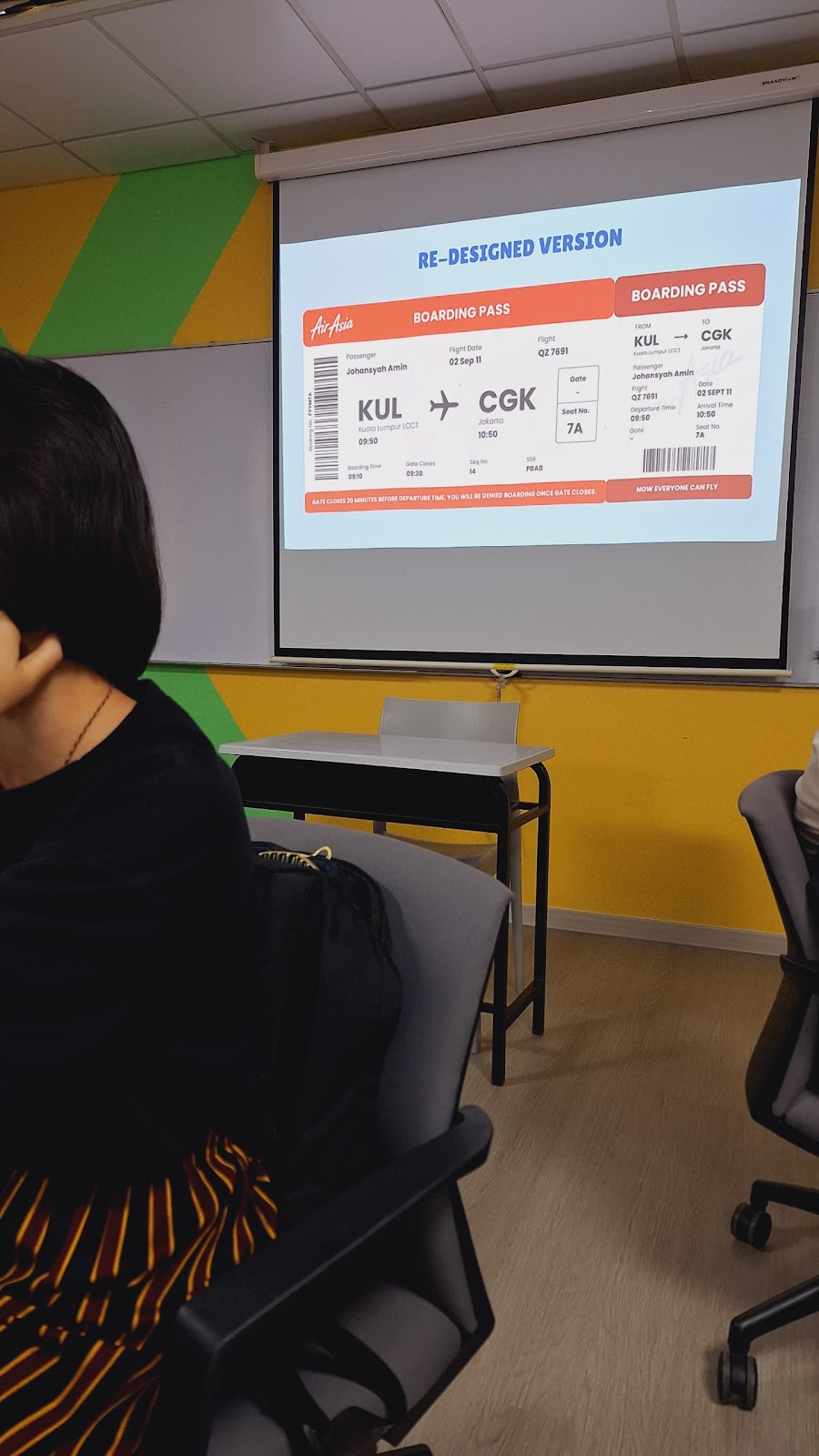
On this week, we learned about good and bad design for user experiences. We were tasked to work in a group based on the table we are seating. Our task is to re design the boarding pass sample given, define the target audience and list all the information on the boarding pass. We had to make sure all of the information should be there during re-design and think about what's the important information passengers would like to see.
My group members consist of me, erene, cai jun, natasha, sun yu and yanyi. My task for this exercises was to define the target audiences and helped them to re-design the boarding pass.
I classified the target audience into 3 class which are :
- Primary - Passengers / Traveller
- Secondary - Airline Staff
- Tertiary - Airport Security and Customs Officials
More Information can be Found on this Presentation Link : HERE
This is the looks after we discuss the boarding pass should looks like. Based on the design, we are more likely to highlight the gate and seat number since it was important things passenger would like to see. for the secondary and tertiary audience they would usually see the places and passenger name.
 |
| Fig 1.1 Re-Designed Version Boarding Pass Week 02 28/04/2025 |
 |
| Fig 1.2 Photo After Presentation Week 02 28/04/2025 |
WEEK 03
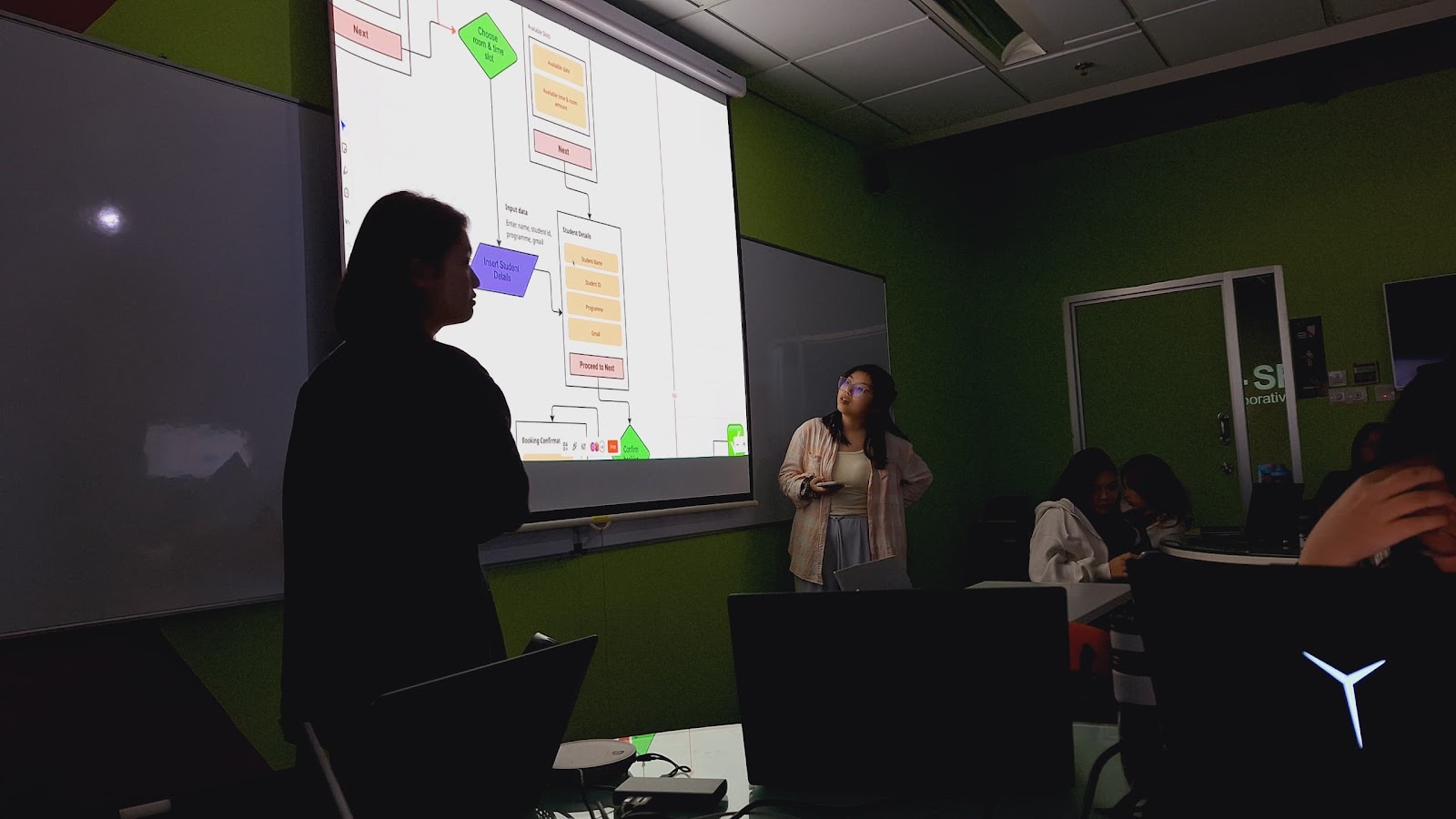
This week, Mr. Razif explained about UI/UX Document. He also showing on a good example of user interface design from ZUS Coffee Brand. After that, we have another group activity where our task is to create a wireflows with 2 scenario option given : book a discussion room and borrow a book.
I still team up with the same members from week 2 activity. We decided to choose book a discussion room as our topic. Cai Jun prepare a miro board and all of us took participate to think and organize the wireflow. View below for the result.
Fig 1.3 Wireflow Outcome for Scenario "Book a Discussion Room" Week 03 05/05/2025
Once we done, 2 members from our group (Natasha and Yanyi) took a presentation part in front of the class. From Mr. Razif feedback, we have made a little mistakes on booking details part since the arrow is doubled. More than that, everything is fine.
 |
| Fig 1.4 Presentation Documentation Week 03 05/05/2025 |
WEEK 04
No class activites - Public Holiday (Wesak Day). I continue my project 1 for this week and consulted with Mr. Razif on 14/05.
INSTRUCTIONS
MIB BOOKLET :
TASK 1
Self Evaluation and Reflections
On this task, we were required to perform a self-evaluation and reflection based on their mobile application design 1 final project. This project aims to document the issues, problems, and difficulties and propose solutions to improve the mobile app design aesthetic and user flow. Mobile App design is an iterative process, and this task will expose to students the constant improvements one can make to their app.
Requirements :
- Submit the E-portfolio blog in My Times.
- Determine what should be changed and improved, and write down every progress in your blog.
Freelancer UI/UX Design Analysis
Before I started the analysis, I duplicate the figma file first in case I want to improve or change a lot of things of it. Mr. Razif told us that we can use AI to give us feedback but not all of the information is accurate so we need to sort it again. For this task, I use GPT and Claude AI (If GPT reach Limit) as my AI.
 |
| Fig 3.1 Freelancer App Showcases Week 01 21/04/2025 |
Freelancer Figma Link (Before Refinement) :
Fig 3.2 Freelancer Figma File (Before) Week 01 21/04/2025
There were many pages inside of the file so I tried to break down by categorize it from beginning into the end.
Reflection and AI Analysis Document
Firstly, I asked AI for feedback regarding on my wireframes design in app design 1. View the file and link below for the result.
Google Docs Link :
Fig 3.3 Self Reflection and AI Analysis Part Week 02 27/04/2025
Refining Prototypes and MVP
After reflect and asking AI for the feedback, Now I have gain an information regarding on what is lack to be refined later. Since I have so many screens and in app design 1, All of that screen have been used for usability testing. I decided to re create my scenario / MVP firstly based on what people usually want to do using the app.
The reason for changing the MVP is to simplified the process and highlight what is important. I realised that my original MVP tried to cover too many tasks at once ( For example : log in and explore around, browse job and apply job) which made the user flow feel overloaded and hard to test in a focused way.
This is the scenario I have used in app design 1. And below is the newest scenario I made for this task.
 |
| Fig 3.4 Scenario Before Week 03 11/05/2025 |
Scenario 1 : Browsing Project Using Filter
You are a freelancer trying to search for a project. You go to search in navigation bar and click the filter icon / the search bar. Insert the information as you want and see the result that match yours.
Scenario 2 : Place a Bid on the Project
In this part, Imagine if you want to place a bid based on the project you have searched for. Before placing it, you already have your profile filled with what needs to be filled in order to apply.
Scenario 3 : Edit / Withdraw a Bid
Scenario 3 : Edit / Withdraw a Bid
On this scenario, Imagine if you want to make a change for your bid or remove it. User navigate to view proposal and can select if they want to remove, edit or view their bid.
From this 3 scenario, I combined into 1 MVP : As a freelancer, I want to browse available projects and submit or withdraw my bid easily.
Finalize MVP Flow :
- Browse Jobs - Job Card and Filter & Sort
- View the Job Details - Job Description & Place a Bid Button
- Place a Bid - Form, Submit
- View My Bid
- Remove / Retract My Bid
PROTOTYPE REFINEMENT
1. On Boarding Pages
For the first page, I decided to refine the on boarding pages. I made a change in the background color from #FFFFFF into off white, gradient with a little bit blue to enchance it apperance. After that, I simplified the description text so user would not felt overwhelmed to read all of it.
I experience by making the header text go to the top while illustration below since i think it suit well and then I tried to find another illustration with same size, so it would look more balanced. I also changed the text weight and darken the "Skip" color. Lastly I changed the 3rd onboarding button screen into long to indicate that those are the end of the pages.
 |
| Fig 3.5 Before and After On Boarding Pages Week 03 11/05/2025 |
From this, I have applied Nielsen’s heuristic of ‘Consistency and Standards’ to improve visual coherence, and Hick’s Law to keep user choices minimal and clear during onboarding. This helps reduce friction for new users.
2. Log In and Sign Up Pages
On log in pages, since it was not really into a core task of MVP Features, I decided to just simplified the flow. It's gonna only contain 3 pages : log in, sign up and reset password. I also changed the background into off white (#FDFDFC) rather than just #FFFFFF.
 |
| Fig 3.6 Before and After Log In and Sign Up Pages Week 03 11/05/2025 |
3. Home Page
On the home page, I did a lot of changed by re adjust all the layout. Firstly I remove the freelancer logo, and then change the notification and messages icon into outlines style. On the search bar then, I changed all of the "job" word into "projects".
The first hierarchy "Popular Services", from the horizontal scrolled, I changed the layout by minimize the logo and make it all go from top to bottom. For "Explore the Trend" I change the images into photo based so it looks more professional and added button to view more ( > ).
More than that, I made a change for the navigation bar by removing the black background and change the color into blue and gray. I experienced with different background for this home page to ensure which one looks better.
 |
| Fig 3.7 Home Page Before and After Week 03 11/05/2025 |
4. Search Pages
On the search pages, the first I did is to change the main option name from "Find a Job" into "Find Projects". The reason why it changed because "Freelancer" is already a job and they mostly did the task / project client requested on.
I review back AI feedback and it have said that the job card alignment felt a bid cramped, so I adjust the size and the weight. View the points that I have changed :
- Navigation Bar and Icon Styles
- Black Background on Top into Gradient Dark Blue - Soft Blue
- Find a Job into "Find a Project"
- Spacing and Padding for the Job Card. I combined Budget and Bids into 1 Label.
 |
| Fig 3.8 Browse Page Part 1 Week 04 14/05/2025 |
 |
| Fig 3.9 Job Card (Before - Left and After - Right) Size Comparison Week 04 14/05/2025 |
- Add Gradient and Volume Into Loading Page, since all of my color are gonna experience with gradient things.
- Updated Filter and Sort Page into Bottom Sheet. User can just tap anywhere / click the back icon to go back. The reason why I changed because the filter have 4 points only meanwhile if want to make it page, it's more suitable for filter that have more 6+ points.
- Some content have be changed since I experience different input for the search & filter.
 |
| Fig 3.10 Browse Part 2 (Loading & Filter) Week 04 14/05/2025 |
5. Place a Bid Pages
Place a Bid pages have an important role since it was a part on MVP features. Once user have done searching from second pages, user can click the job card and read all the job details.
What have I changed on this pages :
- Job Details - Spacing and Budget Range goes to the top under title.
- Adjust spacing for other proposal card and introduce filter the proposal.
- Adjust padding and spacing for Bid Form.
- New Loading page, confirmation, and success status.
 |
| Fig 3.11 Project Details and View Proposal Week 04 14/05/2025 |
 |
| Fig 3.12 Before and After Bid Form Page Week 04 14/05/2025 |
 |
| Fig 3.13 After Placing a Bid Comparison (Before - Top), (After - Bottom) Week 04 14/05/2025 |
6. Manage Pages
On manage pages, I simplified into just 2 pages. I plan to develop only "My Bids" Page since the MVP had require user to view their bids. My Bids page is like a shortcut to view the proposal and also checking the status.
What I changed mostly is the job progress card since I felt it was too cramped. This was the entire process. After I asked few relatives, they likely go to the option 2 ( the middle one) but I change the logo like in the option 3.
 |
| Fig 3.14 Job Card Attempt Week 03 11/05/2025 |
 |
| Fig 3.15 Manage Page Comparison Week 03 11/05/2025 |
 |
| Fig 3.16 Before and After Overall Flow - Manage Pages Week 03 11/05/2025 |
7. Social Pages
I think that social pages is quite least important based on my MVP. Overall I just changed the black background, navigation bar, font size and top icon. If I'm in Short times, I might just go with the front pages of it.
 |
| Fig 3.17 Before and After Social Pages Week 03 11/05/2025 |
8. Account Pages
The last pages, which are account pages, it have 4 sub pages which are account, membership, balance and settings. I asked AI what features should I keep and remove based on my MVP features. Here are the result.
 |
| Fig 3.18 AI Feedback on Account Pages Week 03 11/05/2025 |
 |
| Fig 3.19 Before and After Account Pages Week 03 11/05/2025 |
 |
| Fig 3.20 Comparison Before Gradient and After Week 04 14/05/2025 |
FINAL COMPARISON :
 |
| Fig 3.21 App Design Before Changes & Improvement Week 04 15/05/2025 |
 |
| Fig 3.22 App Design After Improvement Week 04 15/05/2025 |
FINAL OUTCOMES TASK 1 : SELF EVALUATION & REFLECTION
Figma Link : HERE
Fig 3.23 Figma File Preview Week 04 15/05/2025
Canva Link : HERE
Fig 3.24 Final Outcomes Presentation Slides Task 1 Week 04 15/05/2025
Presentation Link : https://www.youtube.com/watch?v=pGUfNl7YCWE
Fig 3.25 Final Outcomes Task 1 : Presentation Video Week 04 16/05/2025
FEEDBACK
Week 1
- You can start to register an education account in flutterflow since the progress take times.
- Logo and Branding from the App could not be changed, it should be default by the original one.
- Your home page screen can be improved.
Week 2
- For the class activities, you should always list down all information firstly, not just go on to tried the design and how should the layout be.
Week 3
- For class activites, All wireflow button should have a clear direction. What to do when user click it or what if they don't click it).
Week 4
- The Job Details have too many color text on it, Instead you can try to place the bid range information under the title with black color.
- It's better to use gradient for the black background on every top screen rather than solid color. It can make looks modern.
- Presentation Slides not compulsory but I advised to create so you can know what to present and more structured.
REFLECTIONS
Experiences
Reflecting back my previous app design 1 was a memorable and exciting journey into this project. At first, I thought the freelancer redesigned was already fine since I have done the usability testing, receiving feedback from various user and research. Turns up, the design still have a lot of room for improvement. This make me learned that we often may not felt satisfied with the design because our thought from app design 1 and app design 2 was different.
Observations
I have observed from class activities and exercises given, I have gain so much new insight from good and bad design until how wire flow really works. Moreover, AI Analysis made me learn more about how important the hierarchy, spacing and padding which is too avoid cramped design.
Findings
Design is a solution for the user. In app design, we should not just focus on the visual but need to have reason why we make it like that, why that information should be on top or not. Doing this project make me learned about UI UX Design thinking, which it's gonna be better if we applied it during the prototype progress.


Comments
Post a Comment