Application Design II | Task 2 : Interaction Design Proposal and Planning
18.05.2025 - 07.06.2025 Week 05 - Week 07
Tracy Angeline Tio / 0362222 / Bachelor of Design ( Honors ) in Creative Media
Application Design II / Taylor's University
TASK 2 : INTERACTION DESIGN PROPOSAL AND PLANNING
Next is to do the Storyboard. For this part, I following from senior structure where it should be divided into 3 phase which is On Enter, On Page and On Exit. Below is the explanation on what phase occurs inside it.
Micro Animation :
Macro Animation :
Once user click the find a project, user would be directed to the search bar and project categories. User have a 3 choices whether they want to use the search bar, click the design categories and using filter and sort on the right side.
At last, there would be a loading screen and it's gonna auto load into the project result pages. The overall of animation can be seen below.
Macro Animation :
I made a little change after user submit a bid frame. Previously it just a normal pop up design but I felt like it's not too attractive. User also need to click when they want to continue which made me think it's better to reduce procedure user need to do.
I searched on lottie animation to find on animation that suited my app style. This is the looks of it. (Link : HERE). In order to convert in figma, I need to save it as GIF file.
Now moving on into our my proposal page since we already post a bid.
Macro Animation :
Macro Animation :
Application Design II / Taylor's University
TASK 2 : INTERACTION DESIGN PROPOSAL AND PLANNING
TABLE OF CONTENTS
LECTURES
WEEK 05
No class for this week since most of students still working on Task 1.
WEEK 06
Class Stream Link : HERE
On this week, our class are conducted online in google meet. Mr. Razif showed us some youtube and article that contains information about UI UX Interaction. After that, he explain to us for the task 2 by providing sample from past student works.
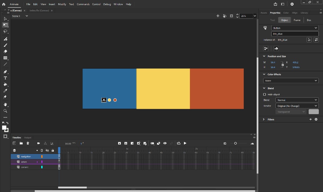
Once we done the briefing, we were given a small exercises. We were required to create account / log in in Lottie Files and try to make one animation from whatever logo we have.
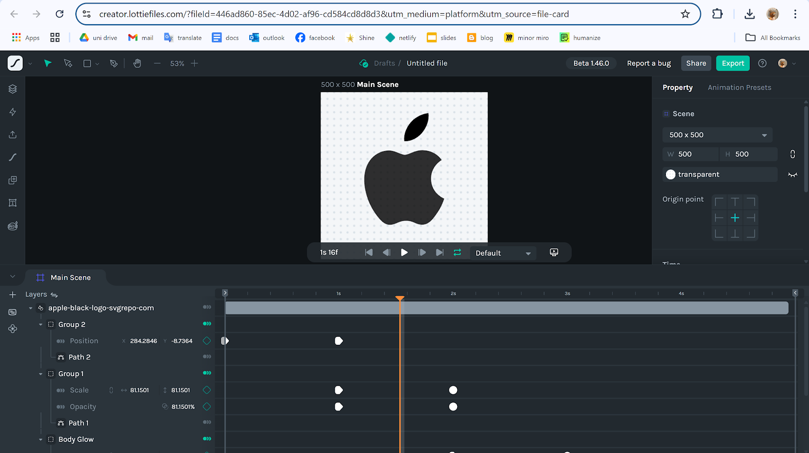
I firstly find one svg logo from the link Mr. Razif given and I choose Apple logo. I adjust it throught the scale, leaf movement and creating outlines as my part of practicing. This is my attempt.
Fig 1.2 Apple Icon Result Week 06 26/05/2025
WEEK 07
Public Holiday. Continue on Task 2.
INSTRUCTIONS
MIB BOOKLET :
TASK 2
Interaction Design Proposal and Planning
On this task, we were required to develop a comprehensive interaction design plan for their final web-based mobile application, including detailed wireframes, user flow diagrams, and prototypes of both micro and macro animations. The goal is to visually and conceptually prepare the interaction design and animations that will enhance the user experience of their application.
Requirements :
- Create interaction design document (detailed flowchart and wireframes that map out the user journey and key interaction points within the application ).
- Create an Animation in our Prototype whether it can be micro and macro animations. Explain it on the blog / documents.
- Video Presentation for Task 2, With the App walkthrough.
---
App Flow Mapping & Storyboard
To began on this task, I started by structuring all the wireframes I have in task 1. Using some past senior blogs, I learned about Micro and Macro animation to gain a better insight. From what I have learned, Micro animation is a small animation like scroll and hover button meanwhile for the macro animation, it looks like the fade and slide or where the background changed color.
To started it, I have import all the choosen screen into figjam and start plan what animation I would like to do. This mapping and storyboard would help me a lot when I want to start creating the animation.
I mostly use fade in / out and slide in ( left right and up ) for the app later. I tried to balanced every screens to avoid too much transition at the same time. This is the preview for the app flow mapping. ( Access the details on the figjam ).
 |
| Fig 3.1 App Flow Mapping Preview Week 06 30/05/2025 |
- On Enter : Describes how elements appear when the screen loads or the user navigates to the page.
- On Page: Describes interactions or behaviors that happen while the user is actively on the screen.
- On Exit: Describes how elements transition out when the user navigates away from the screen.
With the help of past senior sample and UX Lab Assitant, I have developed the storyboard that still align with my flow mapping. I made the summarize for the most transitions I have used :
On Enter :
- Majority of the page used slide in - left, up, right (information, text and project cards) and fade transition to make it looks smooth.
On Page :
- Hover effects for the button to increase interactivity.
- Horizontal / Vertical scroll for the information or categories.
On Exit :
- Mostly slide left / right and fade out ( basically like the opposite of on enter ).
App Flow Mapping and Storyboard Figjam Link :
Fig 3.2 App Flow Mapping & Storyboard Preview Week 06 31/05/2025
Animation Prototype
Once I have planned the micro and macro animation, I began to create the animation in Figma app. I have keep the small animation previously when I did in App Design 1 like hover button for favourites, etc.
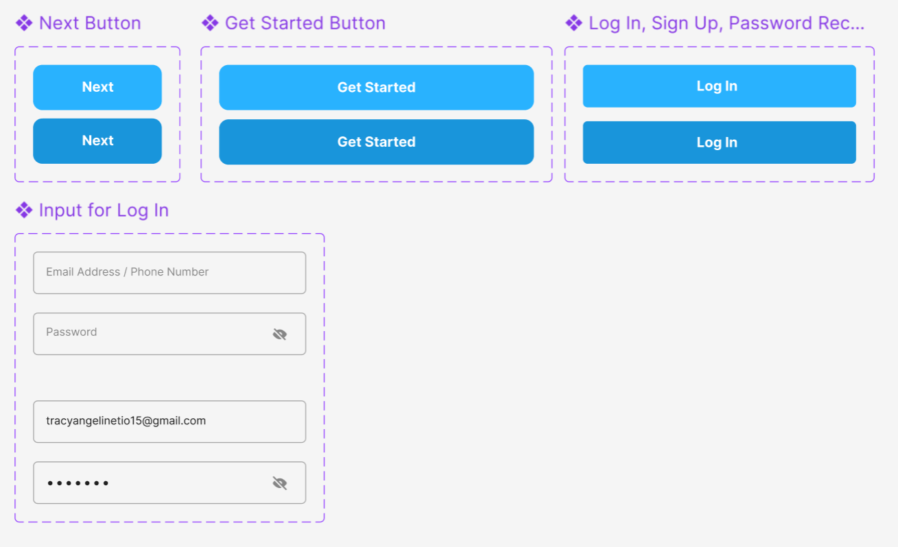
First I made the simple component like button or the navigation bar, so it would make me easier to animate it later. This is the component I made for on boarding & log in pages.
On this pages, I first made a splash screen that can be access on this link for the tutorial (HERE). And then, I applied push animation on it.
- Next and Get Started Hover Button, A subtle scale-up and color change on hover clearly signals interactivity, enhancing visibility of system status and encouraging confident clicks.
Macro Animation :
- Splash Screen on First 3 Pages (Change the Background Color) reinforcing brand recognition and providing immediate system feedback.
- Each onboarding page slides in from the side in a smooth, natural motion that visually reinforces progression and fosters a familiar, consistent navigation flow.
| Fig 3.5 Animation of On Boarding Pages Week 06 01/06/2025 |
2. Log In Pages
For this pages, I'm gonna try to introduce the type keyboard features in flutter flow later. For this prototype, I just make the process straightforward by making the input field into a component so user can just click and the information will be automatically filled up. Despite login pages, I also have reset password and sign up page.
 |
| Fig 3.6 Log In Prototype Screen Week 06 31/05/2025 |
Micro Animation :
- Hover animations on all buttons provide clear visual cues of interactivity, supporting immediate feedback and enhancing user confidence.
Macro Animation :
- A smooth fade-up transition to the home page upon completing the login form offers a seamless and reassuring experience.
 |
| Fig 3.7 Animation of Log In Pages Week 06 01/06/2025 |
3. Home Page
On this pages, I firtly make the component for the navigation bar since I have changed most of it. I was a bit confused at first since I never used figma to create animation. By watching tutorials and sample, I have grow a little bit and gain some knowledge. First, I made frame by frame animation and using after delay with ease out for animation.
| Fig 3.8 Home Page Prototype Screen Week 06 01/06/2025 |
- Horizontal and vertical scrolling in lower content areas provide intuitive content access
- Interactive heart icons deliver clear feedback for user engagement.
Macro Animation :
- A smooth fade-in of the background gradient followed by staggered sliding of greeting, icon, search bar, and featured sections ensures a clear visual hierarchy and seamless onboarding to the home page.
4. Search Pages
I followed my storyboard where I would have a slide left transition for the option on the services, Then I made the hover button on it.
 |
| Fig 3.10 Browse Pages (Front) Week 06 01/06/2025 |
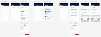 |
| Fig 3.11 Browse Project Core Scenario Screen Week 07 02/06/2025 |
Micro Animation :
- Hover and tap interactions, including a dynamic blue background with white text and arrow for options, heart icon feedback, and vertical scrolling for project categories, ensure intuitive exploration and immediate feedback.
Macro Animation :
- Slide-in transitions for options and project cards combined with smooth fade effects establish a clear visual hierarchy and maintain user orientation as new content is revealed.
- The filter page smoothly pops up from the bottom to preserve context and streamline decision-making without full-page disruption.
- A transitional loading animation after search input provides clear system feedback and reinforces user confidence during data retrieval.
5. Project Details Pages
After user has select the project they want to do, the next step is by clicking the card and the information would slide up, include the button to place a bid. This step basically just fill in the form and add milestones. User can click the button to proceed and they still could view, edit or retract their proposal.
 |
| Fig 3.13 Place a Bid Screen Prototype Week 07 02/06/2025 |
 |
| Fig 3.14 Bid Submitted (Before Changes) Week 07 02/06/2025 |
 |
| Fig 3.15 Bid Successful Payment Animation Week 07 02/06/2025 |
 |
| Fig 3.16 Bid Actions (View, Retract and Edit) Screen Prototype Week 07 02/06/2025 |
Micro Animation :
- Smooth scrolling, button hover effects, and clear toast/pop-up notifications ensure easy navigation and confident interactions.
Macro Animation :
- Slide and fade transitions for project details and loading screens create a clear, smooth experience during bid actions.
6. Manage Pages
The manage pages were quite easy to do. There are only 4 pages and I made the shortcut to view our proposal directly. I applied after delay mostly so it would animate to the next frame. I just made the elements slides from left and using ease out for smooth scroll.
 |
| Fig 3.19 Manage Page Screen Prototype Week 07 02/06/2025 |
Micro Animation :
- The project card can be a quick shortcut to go view my proposal. This would help user find a quick way without wasting much time.
Macro Animation :
- The tasklist, recently viewed, and my bids options smoothly slide in from the left, creating clear context and seamless navigation for better task management.
 |
| Fig 3.20 Animation of Manage Page Week 07 02/06/2025 |
7. Social Page
This pages was the easiest one since i jut have 2 screen in oder to make the smart animate transition by making all the button card come from the left together. I didnt include much features to highlight since I only focusing to the bid things.
- -.
Macro Animation :
- The options (groups and posts) comes by slide left to create a clear, and smooth experiences.
8. Account Pages
The last pages which is the account pages, I don't have many issue when working on this part. There were a total of 5 pages and I developed the user profile since the bid app basically are gonna look at our profile too.
 |
| Fig 3.23 Account Page Prototype Screens Week 07 02/06/2025 |
Micro Animation :
- Horizontal and vertical scrolling in the profile page ensure easy navigation and content exploration.
Macro Animation :
- Background gradients, titles, and icons fade in, while membership, balance, settings, and the profile page itself slide in from the left to create a clear visual flow and seamless user onboarding.
 |
| Fig 3.24 Animation on Account Pages Week 07 02/06/2025 |
FINAL OUTCOMES TASK 2 : INTERACTION DESIGN PROPOSAL AND PLANNING
Figma Link : HERE
Fig 3.25 Figma Workspace File Week 06 01/06/2025
Prototype Link : HERE
Fig 3.26 Figma Prototype Preview Week 06 01/06/2025
Presentation Video Link : https://youtu.be/XWvnJ_CeV9Y
Notes : Animation in Figma is a Little bit Lagging.
Fig 3.27 Final Presentation Video Task 2 Week 06 02/06/2025
FEEDBACK
No feedback given for this task.
REFLECTIONS
Working on this task has been a valuable and challenging journey at the same time. As I'm not familiar with animation in Figma, I spend a lot of time figuring out how to make like what I want and facing the struggles whenever the component didn't move. More than that, for me the important part is adjusting the timing of it. We need to always checked on how many ms would suited for the type transition.
As the deadlines suddenly move faster, I need to catch up and quickly make it, which led me learned on how to work faster despite the struggle and challenge I have. Overall, I was quite satisfied with the result I made in the short time and I would like to see in the next task if the interaction can be improved.



Comments
Post a Comment