Advanced Interactive Design | Task 2 : Interaction Design Planning and Prototype
18.05.2025 - 10.06.2025 Week 05 - Week 08
Tracy Angeline Tio / 0362222 / Bachelor of Design ( Honors ) in Creative Media
Advanced Interactive Design / Taylor's University
TASK 2 : INTERACTION DESIGN PLANNING AND PROTOTYPE
TABLE OF CONTENTS
LECTURES & ACTIVITIES
WEEK 5
This week, we were given a two exercises which are animating the symbol and masking. Firstly, we were instructed to draw a spider and we have to animate the leg movements and the eyes. This is my attempt progress.

Fig 3.1 Spider Drawing Week 05 20/05/2025
We need to convert all of it into symbol - graphic. After that we double click and create a keyframe in order to move the leg and eyes. After that, we just need to go back into the scene file, insert keyframe when the animation end. |
| Fig 3.2 Animate the Symbol Week 05 20/05/2025 |
I moved the spider from top of canvas into the bottom canvas in frame 30. After that I applied classic tween and change the effect into bounce ease out. More than that, Mr. Shamsul also told us to add the spider strings and we add classic motion guide to make it. This is the result for the exercises 1.
Spider Animation Look :
 |
| Fig 3.3 Add Motion Guides Week 05 20/05/2025 |
Fig 3.4 Spider Outcomes Week 05 20/05/2025
--- After the spider animation, Mr. Shamsul demonstrate masking tutorials in class. We need to find a picture as instructed and place it in our file. Then we applied ruler in the middle (tv) box and add the lines (Object Drawing must be turn on for this part!).
 |
| Fig 3.5 Progress #1 Week 05 20/05/2025 |
 |
| Fig 3.6 Line Tools & Break it All into Separate Layers Week 05 20/05/2025 |
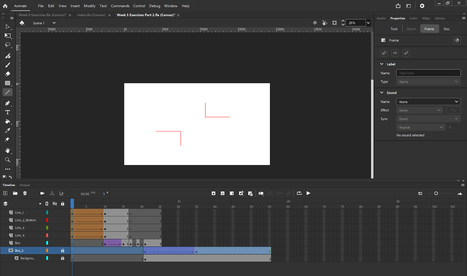 |
| Fig 3.7 Timeline View Week 05 20/05/2025 |
Fig 3.5 Exercises 2 Outcome Week 05 20/05/2025
WEEK 6
This week, we have an online class due to ASEAN summit. Our activities is to practice on making the clickable button with animation on it. First thing to do is by setup our file and stage and then add rectangle and text on it. We need to convert the text and button into graphic and then we select both of it and copy. Paste it on the new layer and convert to button.
 |
| Fig 3.8 Edit Button Place Week 06 27/05/2025 |
We learned something new whic is the action button when we right click the keyframe and select the action. We need to click add using wizard to began.
At last, to make the animation stop, we added more action in frame 40 and choose stop. This is the full preview for the timelines. The results are shown below.
 |
| Fig 3.9 Action Script Preview for Button Week 06 27/05/2025 |
 |
| Fig 3.10 Timeline Preview Week 06 27/05/2025 |
Fig 3.11 Button Exercises Outcome Week 06 27/05/2025
WEEK 7
This week, we have a class and our exercises is to create an opening animation and the button to entering the main website. Mr. Shamsul took a references from FWA Awards and we need to re create the animation of it. Below are some progress of the working.
 |
| Fig 3.12 Working Progress Week 07 03/06/2025 |
 |
| Fig 3.13 Progress #2 Week 07 03/06/2025 |
Fig 3.14 Week 7 Activity Outcome Week 07 03/06/2025
WEEK 8
No class for this week. Working on Project 2.
INSTRUCTIONS
MIB BOOKLET :
TASK 2
Interaction Design Planning and Prototype
On this task, we were required to work on their visual design and start planning their website’s interactive design elements and features. Unlike traditional static website, when it comes to interactive design where animations are present, the plan not only should include the layout visuals but also the animation example or reference. Students can build their animation or user-reference animation to demonstrate the intended idea.
Requirements :
- Walkthrough Video presenting the plan and showing the animation examples and/or references.
- Online posts in your E-portfolio as your reflective studies with links to any resource involved in the creating of the plan. (i.e.: Figma link, Miro link, etc.)
---
Review on Task 1
Previously on task 1, I have made the wireframes and Mr. Shamsul commented that it's already clean but I can improve some of the design page so it doesn't look ordinary.
 |
| Fig 3.1 Preview from Task 1 Wireframe Ideation Week 04 16/05/2025 |
First, I looked back at my user flow chart and start duplicate and revise some part. I was doubt with the page whether I need to add / reduce some but later I solved it by stick to my recent attempt. The user flow chart for the new one would provide a details interaction user can do on the website.
 |
| Fig 3.2 Updated User Flow Chart Week 07 08/06/2025 |
Finding and Creating Assets
As I have stated the visual style in Task 1 previously, I have chosen the photo style to express the minimalist and elegance style. For the assets, I browse the photo through pinterest and pexels as the sources. For the toppings photo, It was generated using AI to ensure the image consistency and style. Below are the assets I compiled together.
 |
| Fig 3.3 Image Assets for Website Week 07 08/06/2025 |
Refining Prototype Design
Loading Page
I select 1 from the two attempts I made in task 1. I choose the health bar since it would be efficient and match to the theme. The loading page is designed with Fudgy Brownies Picture and the gradient bar to align with the theme and visual style. The animation would be a gradient color transition from dark into light in the bar like an example from D&G Loading Text.
To do so, I adjusted the fill and linear part and applied after delay for it. This was the frame looks.
 |
| Fig 3.4 Loading Pages Frames Week 07 08/06/2025 |
Landing Page
After the loading page, user would automatically jump to the landing page where it give user task to act something. For the animation, the elements come one by one using slide up and slide down (Macro Animation in UI UX) start from the title, the brownie and the crumbs. User need to click the brownie to began.
 |
| Fig 3.5 Landing Pages Frames Week 07 08/06/2025 |
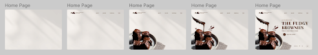
Home Page
I decided to refine everything for this part. I made 6 variations, tested on different color to make sure which color suited well. After asking feedback from friends, I decided to go with Home Page -1. I also like the 3rd one so I kept it for the procedure pages.
 |
| Fig 3.6 Home Page Exploration Week 07 08/06/2025 |
 |
| Fig 3.7 Home Page Frames Week 07 08/06/2025 |
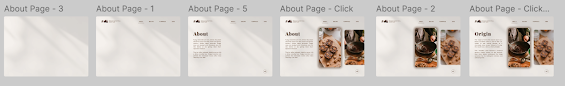
About Pages
ln task 1, I have made this wireframe already but now I changed the background style, along with the images. Below are the comparison :
 |
| Fig 3.8 About Page Before(Top) and After (Bottom) Week 07 08/06/2025 |
 |
| Fig 3.9 About Page Frames Week 07 08/06/2025 |
Recipe Pages
l also did a refinement for this page especially for ingredient list, I changed it into card based so user no need to click all of the ingredients one by one.
 |
| Fig 3.10 Recipe Page Before(Top) and After (Bottom) Week 07 08/06/2025 |
 |
| Fig 3.11 Some Recipe Page Frames Week 07 08/06/2025 |
 |
| Fig 3.12 Recipe Page Part 2 - Procedure Week 07 08/06/2025 |
 |
| Fig 3.13 Card Look when Clicked the Button Week 07 08/06/2025 |
Toppings Page
On this page, I also have explored a new layout and I got this references by sushi stall where the toppings would have an infinite loop design.
 |
| Fig 3.14 Toppings Page Before(Top) and After (Bottom) Week 07 08/06/2025 |
 |
| Fig 3.15 Toppings Page Frames Week 07 08/06/2025 |
Tips Pages
The last page which is the Tips part, I followed my previous task structure but a little bit refinement on it. The Tips page were designed in carousel styles. The animation remains same when user click the page firstly, a fade and slide animation and then the carousel would fade and scale. There was a total of 4 tips. Button would have the hover.
 |
| Fig 3.16 Tips Page Frames Week 07 08/06/2025 |
FINAL OUTCOMES TASK 2 : INTERACTION DESIGN PLANNING AND PROTOTYPE
Canva Link : HERE
Fig 3.17 Final Task 2 Planning and Prototype Week 08 09/06/2025
Final User Flow Chart : HERE
Fig 3.18 Final User Flow Chart Week 08 09/06/2025
Final Wireframe Working File : HERE
Fig 3.19 Wireframe View in Figma Week 08 09/06/2025
Final Prototype : HERE
Fig 3.20 Prototype Screen in Figma Week 08 09/06/2025
Final Presentation Video : HERE
Fig 3.21 Final Presentation Video Week 08 10/06/2025
FEEDBACK
Week 9
- The shadow for ingredients part need to be consistent like other styles as well.
- Overall the prototype looks nice already, you can start to move into adobe animate.
REFLECTIONS
Working on this project was challenging and fun. I gained valuable things especially when designing the wireframe, I got a new knowledge by keep exploring more layout style. At the same time, the challenging part is when we have to built this into adobe animate later, I have to make sure that the wireframe I made have a possibilities to be developed in animate.
What I learned from this module is we need a strong foundation and concept before jump into wireframes. User flow chart plays an important part on it and it's better to finished the flow chart before jump into the content prototype. No proper foundation can resulting into confusion during the design phase.


Comments
Post a Comment